
They say music is subjective and that, as a form of art, individuals interpret the songs they hear based on their own knowledge and preferences. If that is the case, than how can the “top 100’s” that exist today truly depict the most popular songs, artists and albums of our era? The tracking and data collection of music sales began during the mid-15th century. During this time, mechanical processes for printing music were first developed and sheet music sales took their precedence as the first form of music to ever tangibly be sold. Dubbed music publishing today, the process of copyrighting a piece of musical work truly took shape in 1831 when the allowance of copyrighting musical compositions was expanded into the first federal copyright law in the United States. This addition sparked composers and artists to realize the value of their work and obtain payment for performances of it.
Today, performing rights societies such as ASCAP, BMI and SESAC work to rightfully provide musicians of all kinds with the royalties (payments) they deserve from the sales and performances of their work. Sales and plays are tracked by industry leaders such as Billboard, Spotify and iTunes, which are then used to generate the top artists, albums and songs of a designated time period. These top picks are evaluated in many different ways; taking into account radio play, song and album purchases and even live performances. The main flaw with the calculation of a top 100 stems from the inaccuracy to cater the selection toward a certain demographic or location. Record sales in California could drive Maroon 5 to the top ten artists’ list on Spotify, but a die-hard Bon Iver fan in Manchester, Vermont would quickly disagree.
That being said, it came to my attention that the “top 100’s” are never evaluated using the most powerful indicator; public opinion. Using an application known as Statistica, I decided to evaluate the eight most common genres on a broader scale, truly defining the buzz that they create throughout the United States and breaking my results down to an easy-to-understand pie chart. Before I provide you with the results however, it is important to describe the process used to reach them.
First, I researched the most popular websites that Americans use to gain musical insight; these pages included, but were not limited to, Pitchfork, Rolling Stone, NY Times music section, Billboard, and Buzzfeed’s music sector. While a lot of the webpages used are opinion-based blogs, the actual insights they provide into America’s musical preferences are unprecedented and extremely overlooked. Using these URL’s, I ran a web crawl on Statistica, which ultimately “crawls” through each and every URL and finds the many paths’ that belong to it. The easiest way is to think of the URL as a shopping mall and all of its’ individual pages as stores. The web crawl would than become a directory of every single store in that mall, which in my case, ran about 3,000 in number.
Once the web crawl was finished my “directory” was ready to be sorted and this is where the real results came into view. For purposes of running a text mine on the results, I needed some sort of dictionary to compare the paths against. After coming up with my genre categories, also known as inclusion words on Statistica, I was left with eight segments; country, hip-hop, RnB, Pop, Rock, Indie/ Alternative, EDM/ Dance, and Jazz/ Blues. I then had to create my own music industry dictionary, assigning words to each category. These words included the top 100 artists that were listed for each genre and words that are typically used in those specific genres’ tracks. For example, my “country dictionary” would include words such as America, beer, bonfire, Carrie Underwood, Home, Kenny Chesney, etc.. Whereas the hip-hop dictionary listed beat, Beyoncé, club, Drake, homie – you get the picture. The dictionary I created for all of the genres, in total, equated to about 300 words and was more than enough to be a strong indicator for purposes of results.
With these preparations, I was ready to begin text mining, which is the final step in this particular data mining process. Text mining takes all of the words that you feed into it and compares them against the URL paths you’ve generated from the web crawl, assigning them to the categories you pre-determine. Essentially, if we’re going back to the mall analogy, the text mining is the inventory of each store in our directory and tells how much of something (in this case a particular genre) is “in stock” (or mentioned). Stay with me, because I’m just getting to the fun part!
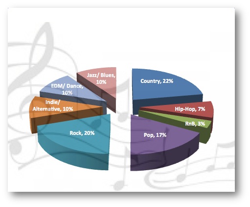
After waiting for what seemed like days, but was probably more like an hour in time, my text mining had finished and the results were in! To simply summarize what I discovered, I summed up the total number of tracked words from my dictionary on all of the website paths, which came to 22,410. Using this number as a denominator, I took the results for each individual category as the numerator, which gave me there share percentage. I then used Excel to generate a pie chart that shows us “America’s Top 100”; the genres that America collectively creates the most buzz about.
The methodology applied to artist, song and album analytics for all three-industry players; iTunes, Spotify and Billboard, remain the same. These companies generate their top 100’s based on sales and plays. The sales are of course are calculated and then stored, where patented programming is able to decipher which artists are selling the most albums at any given time and the songs that have been played the most during that period. The flaw in this calculation however, lies within the advances of technology and the rise of music piracy. Today, only 10% of the human race still purchases music (excluding individuals that pay for monthly subscriptions to streaming services such as Spotify). Even those streaming services however, have imperfections in calculating plays. For example, Spotify users that have “free” accounts are only allowed a certain number of song skips while listening. Therefore, listeners may not be intentionally choosing what they listen to or skip through, because the site doesn’t allow it. That being said, to what degree of accuracy can we assume that the album purchases by 10% of individuals would accurately depict the preferences of the remainder of the world?
By data mining and including websites that are based on public opinion, the popularity of each genre in our nation is more truthfully represented. We can see that most of America prefers country and rock, rather than the always referred to genre of pop. While I plan on enlarging the dictionary and rerunning this experiment monthly to track the regularity of the statistics, this same process could be used to depict genre popularity in a more specific location as well; for instance, the popularity of each genre in the city of Connecticut or Nashville. As you may predict, the results would be drastically different, unlike the conventional top 100’s that claim to represent the same outcomes for every city across the U.S.. Data analytics such as these have yet to be touched upon in the music industry today, but could seriously reinvent the wheel that we use to evaluate musical preferences. Imagine if a music venue in Boston, Massachusetts were able to accurately showcase the musical opinions of their community before choosing a concert line-up for the upcoming year – this could impact sales for the venue and revenue for the city at large. While they say if it’s not broke, don’t fix it, no one ever said not to make it just a little bit better, and I believe that is exactly what this process could do for the tracking of music in today’s day and age.
This project was advised by: Dr. Brian Marks & Dr. Armando Rodriguez
Click here to view the University of New Haven’s, Economic Collective where a corresponding article is posted.
